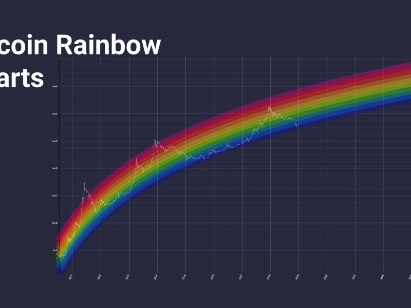
The Bitcoin Rainbow Chart is a powerful long-term price prediction tool that combines logarithmic regression with vibrant color bands. By analyzing market sentiment and price trends, it helps investors make informed decisions about buying, selling, or holding Bitcoin. This chart has gained popularity for its ability to highlight potential opportunities in the volatile world of cryptocurrency.
What is the Bitcoin Rainbow Chart?
The Bitcoin Rainbow Chart, a popular tool used to predict the price of Bitcoin, has garnered significant attention for its colorful representation of potential market trends. While it’s not a foolproof method for predicting the future of Bitcoin, it provides an intriguing visual perspective on the cryptocurrency’s historical price fluctuations.
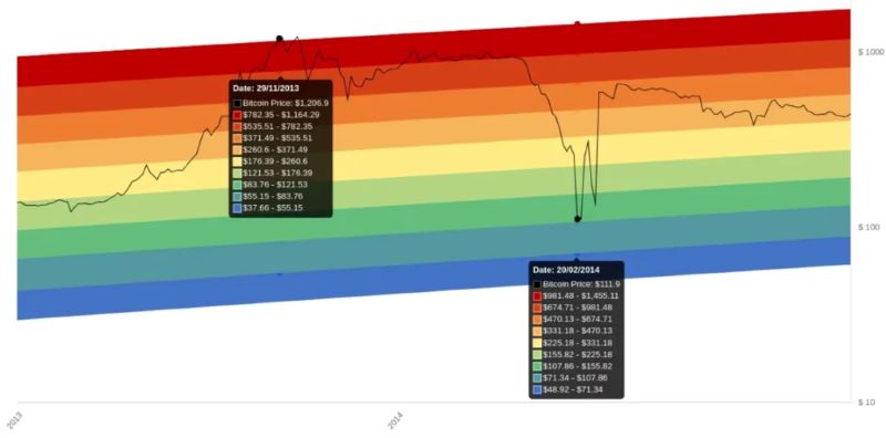
The Bitcoin Rainbow Chart is essentially a logarithmic regression model combined with nine distinct colored bands. It aims to visually illustrate Bitcoin’s potential price movements based on historical data and trends. Each color band represents a different price range, signifying potential bullish or bearish market conditions.
The Bitcoin Rainbow Chart originated in 2014 when a Reddit user, Azop, created it as a fun and insightful tool. Initially intended for entertainment purposes, it gained traction within the cryptocurrency community and has since evolved into a widely recognized metric used by many investors and traders. The core concept behind the chart is attributed to Ridololo, a user on Bitcoin Talk forum, who developed the logarithmic regression model in 2014. This model analyzes the non-linear relationship between various factors influencing Bitcoin’s price.
How to Interpret the Bitcoin Rainbow Chart
Understanding the Rainbow Chart’s elements is crucial for deciphering its potential implications. The chart utilizes logarithmic regression to map Bitcoin’s historical price data onto the visualized bands. This approach accounts for the exponential growth patterns inherent in the cryptocurrency market.
Understanding the logarithmic regression model
The logarithmic regression model plays a vital role in the Rainbow Chart’s functionality. It analyses the long-term data of Bitcoin’s price and identifies patterns that indicate potential price developments. The model’s mathematical analysis helps project future price movements based on historical trends and cyclical patterns.
Decoding the color bands and their significance
Each of the nine color bands on the Rainbow Chart represents a distinct price range and signals potential market conditions. The different bands and their associated meanings are:
- Blue: Signals a significant price drop, presenting a favorable buying opportunity.
- Light Blue: Represents an undervalued price point, suggesting a good time to buy.
- Green: Indicates a period of accumulation and holding.
- Yellow: Signals a time to HODL (Hold On for Dear Life), suggesting market stability.
- Orange: Advises researching the market, implying potential volatility.
- Red: Indicates a potential bubble, recommending selling.
- Dark Red: Signals an impending bubble burst, discouraging purchasing.
Current Bitcoin price position on the Rainbow Chart
As of [Date], the price of Bitcoin sits at [Bitcoin Price]. This currently places Bitcoin within the [Color] band of the Rainbow Chart, suggesting [Market Condition].
Analyzing the Pros and Cons of the Bitcoin Rainbow Chart
Despite its popularity, the Bitcoin Rainbow Chart has both advantages and disadvantages worth considering. While it offers valuable insights into Bitcoin’s long-term price behavior, its limitations should be acknowledged.
Advantages of using the Rainbow Chart for Bitcoin analysis
One key advantage of the Rainbow Chart is its ability to visually represent Bitcoin’s long-term price trends in a clear and intuitive manner. Its color-coded bands are easy to comprehend, even for novice investors. The chart’s simplicity and user-friendliness make it accessible to a broader audience.
Furthermore, the Rainbow Chart can provide valuable context for other investment decisions. By analyzing the long-term trends of Bitcoin, investors can gain a better understanding of the overall cryptocurrency market and its dynamics. This broader perspective can aid in strategizing investments in other cryptocurrencies or related assets.
Limitations and potential drawbacks to consider
It’s crucial to acknowledge that the Rainbow Chart is not a perfect prediction tool. Although it has historically aligned with Bitcoin’s price movements, it’s not foolproof. The chart relies on historical data and trends, which may not be a reliable indicator of future price behavior.
One limitation of the Rainbow Chart is its focus on long-term price trends. It doesn’t account for short-term price fluctuations and market volatility, which can significantly impact investment decisions. Moreover, the chart’s reliance on a subjective interpretation of the color bands can lead to misinterpretations or biases in decision-making.
Applying the Bitcoin Rainbow Chart in a Broader Context
The Bitcoin Rainbow Chart can be applied to other cryptocurrencies beyond Bitcoin, offering valuable insights into their long-term price behavior. However, it’s important to note that the chart’s accuracy may vary depending on the specific cryptocurrency and its market dynamics.
Using the Rainbow Chart for other cryptocurrencies
Extending the Rainbow Chart concept to other cryptocurrencies is a common practice. By applying a similar logarithmic regression model and color-coded bands, investors can analyze the long-term price trends of other cryptocurrencies, such as Ethereum. However, it’s crucial to remember that each cryptocurrency’s market dynamics are unique and may not fit the same pattern as Bitcoin.
Comparing the Rainbow Chart to the Bitcoin Stock-to-Flow model
The Bitcoin Stock-to-Flow model, another popular metric used for Bitcoin price analysis, differs from the Rainbow Chart. The Stock-to-Flow model focuses on the relationship between Bitcoin’s supply and demand based on its halving events, while the Rainbow Chart relies on historical price data and market psychology.
Both models provide valuable insights, but their methodologies and focuses differ significantly. Investors should consider both models alongside other analytical tools to gain a more comprehensive understanding of Bitcoin’s price dynamics.
Evaluating the Accuracy and Reliability of the Bitcoin Rainbow Chart
The Bitcoin Rainbow Chart’s accuracy and reliability have been subject to ongoing debate within the crypto community. While historical data suggests a correlation between the chart’s predictions and Bitcoin’s actual price movements, it’s not a guaranteed predictor of future behavior.
Historical accuracy and correlation with Bitcoin price movements
The Rainbow Chart has demonstrated a degree of accuracy in mapping Bitcoin’s historical price movements. During past market cycles, the chart has accurately reflected major price trends and has served as a valuable tool for identifying potential buying and selling opportunities.
However, it’s important to note that past performance is not necessarily indicative of future results. Market conditions and influencing factors can change, potentially altering Bitcoin’s future price behavior and influencing the chart’s predictive accuracy.
Factors influencing the chart’s predictions
The Rainbow Chart’s predictions are influenced by various factors, including Bitcoin’s supply and demand dynamics, market sentiment, regulatory changes, and technological advancements. External events beyond the cryptocurrency market can also impact Bitcoin’s price, affecting the chart’s accuracy.
Importance of combining with other analytical tools
To enhance the reliability and accuracy of investment decisions, it’s recommended to combine the Rainbow Chart with other analytical tools and fundamental analysis. This approach provides a multi-faceted perspective on Bitcoin’s price dynamics and reduces the risk of relying solely on one indicator.
By incorporating multiple analytical tools and considering various market factors, investors can gain a more comprehensive understanding of Bitcoin’s price trends and make informed decisions that align with their investment strategies.
While the Bitcoin Rainbow Chart offers a visually appealing representation of potential market trends, it’s essential to approach it with a critical eye and consider its limitations alongside other analytical tools. It serves as a valuable resource for understanding long-term price behavior and gaining market insights but should not be solely relied upon for making investment decisions.
Ready to dive deeper into the Bitcoin Rainbow Chart and enhance your investment strategy? Discover how this tool can help you navigate the cryptocurrency market effectively. Join Coinls now for exclusive insights and updates!


